
The Power of Observation
The Power of Observation
By Edward Grazda
Book Details:
166 pages
750 copies
4.5 x 6.5 inches
ISBN 979-8-9949580-1-8
Designed by Francesca Richer
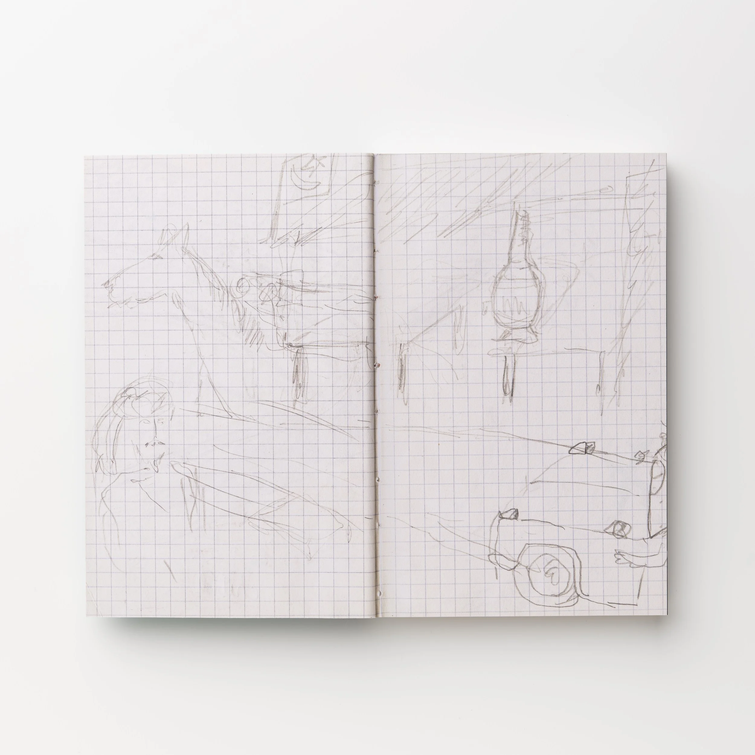
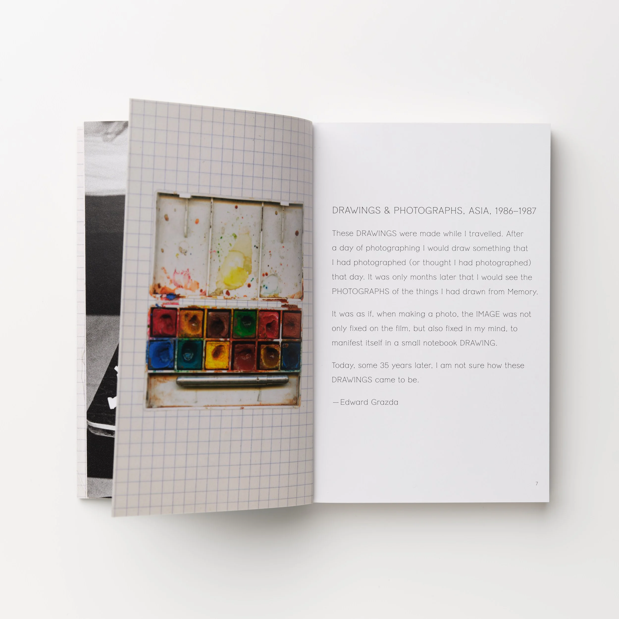
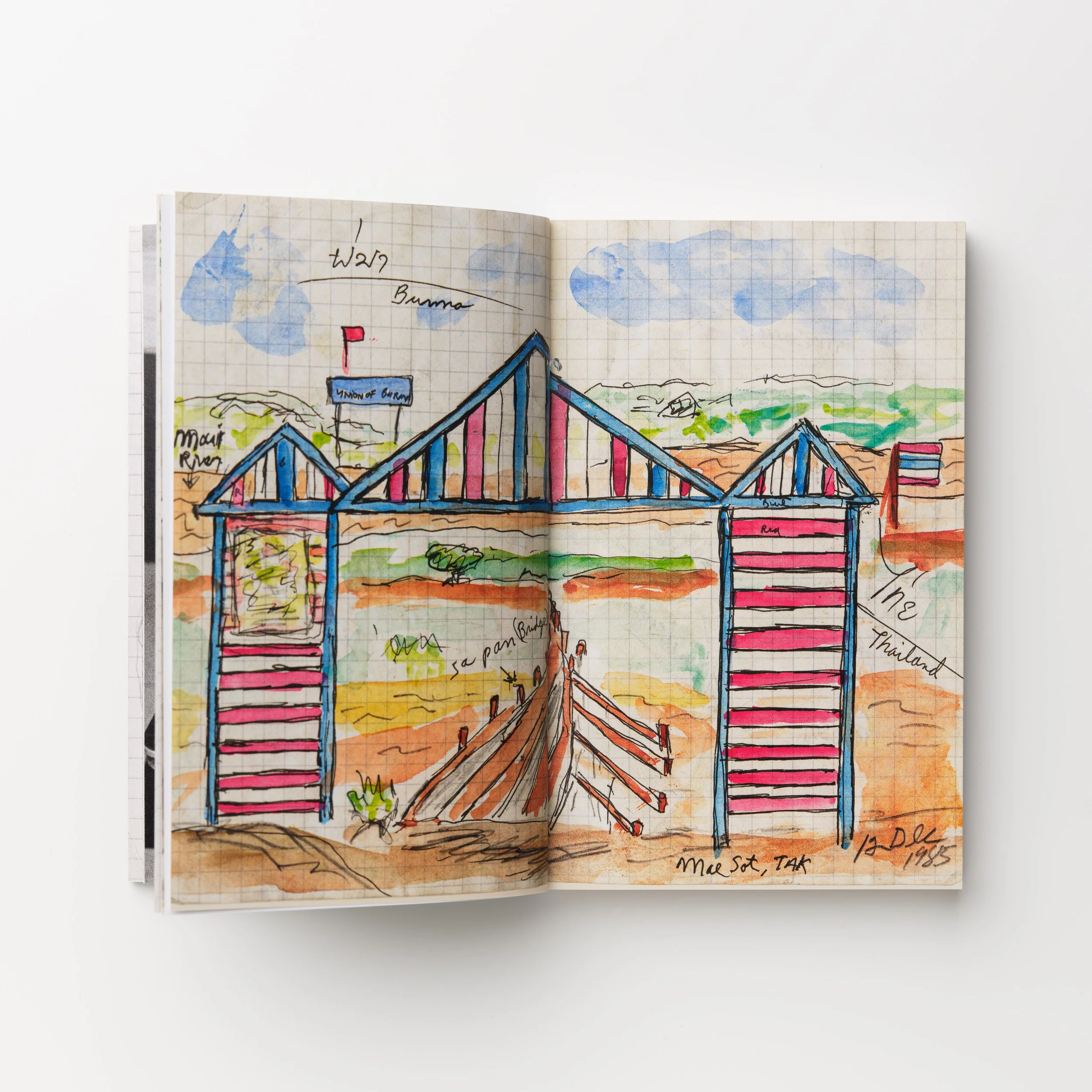
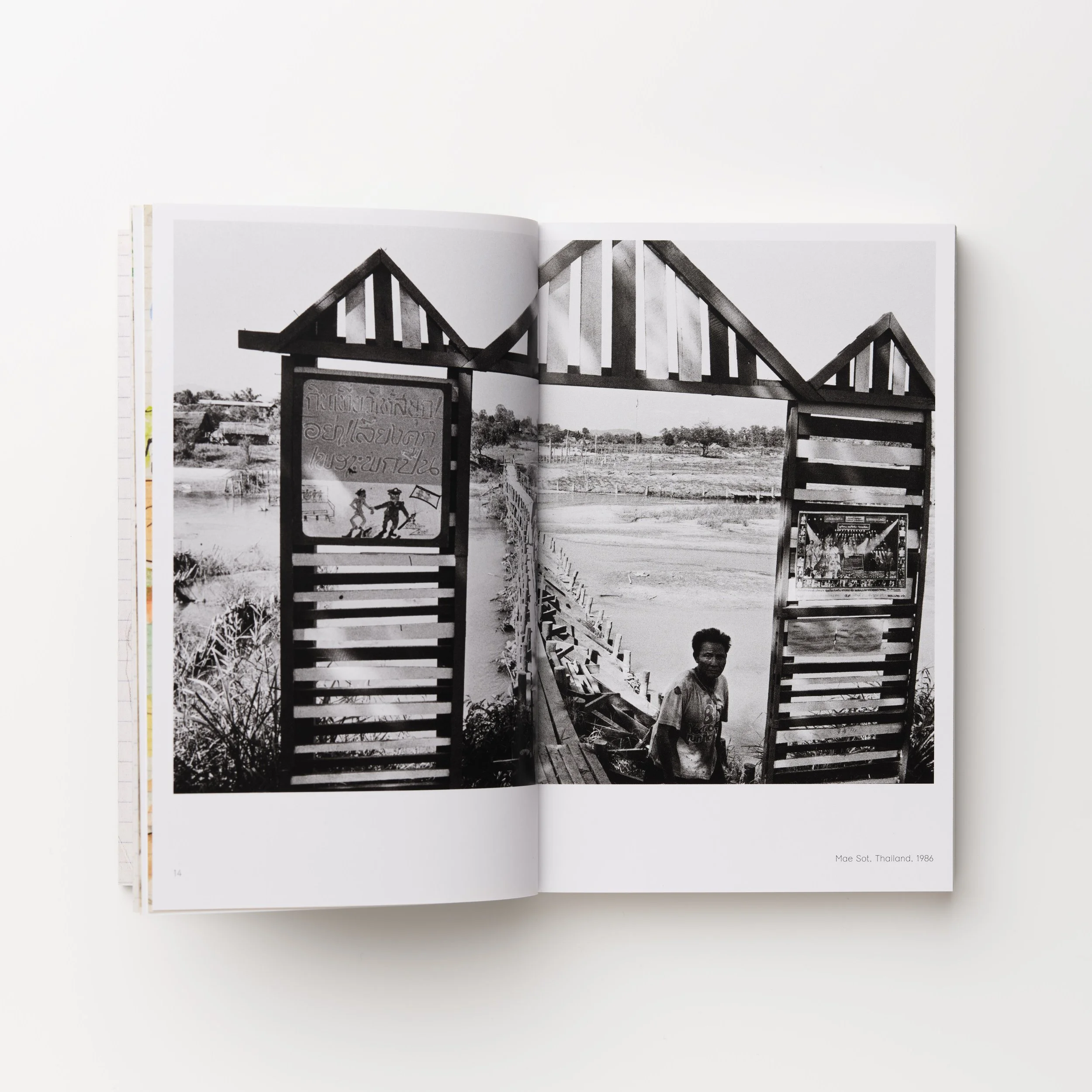
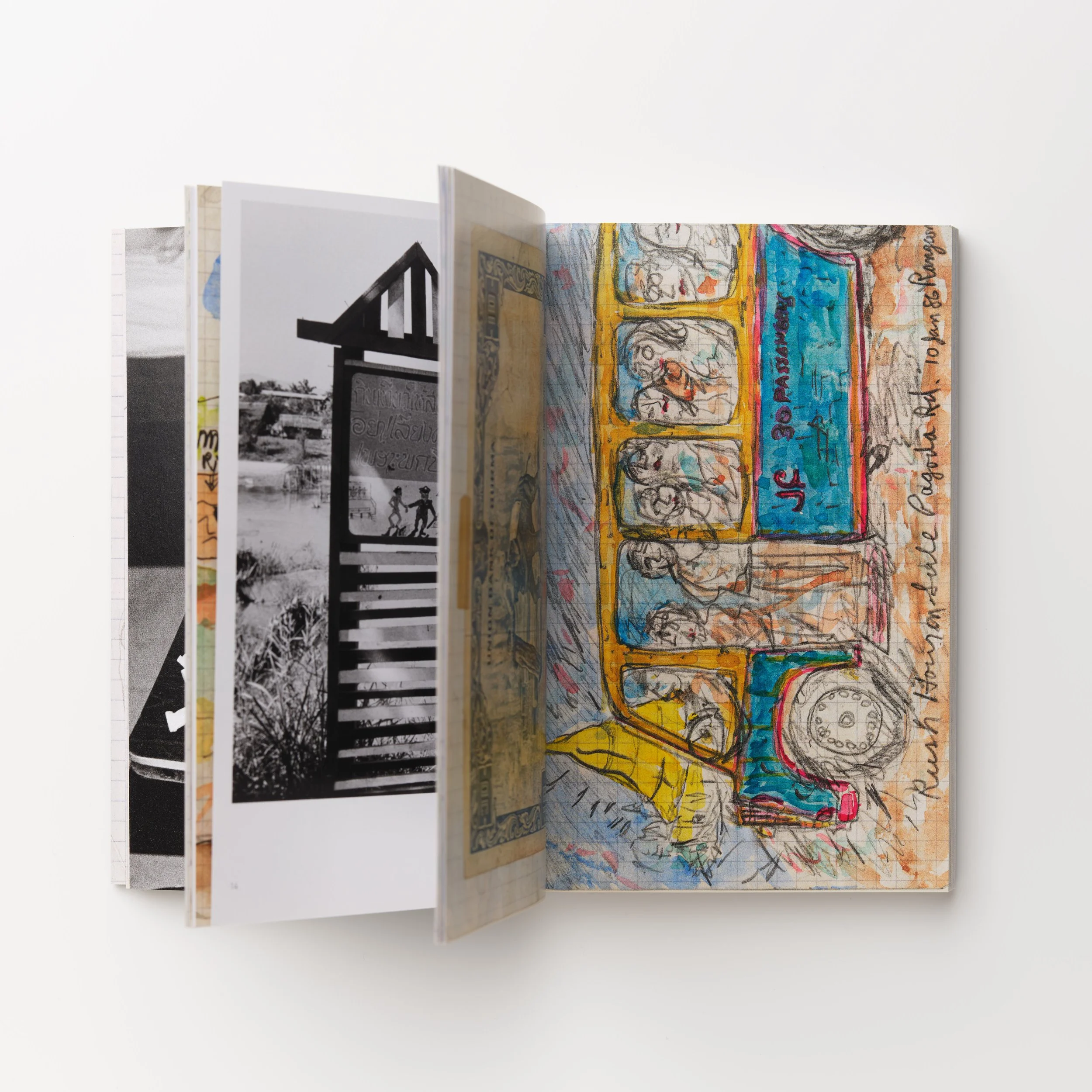
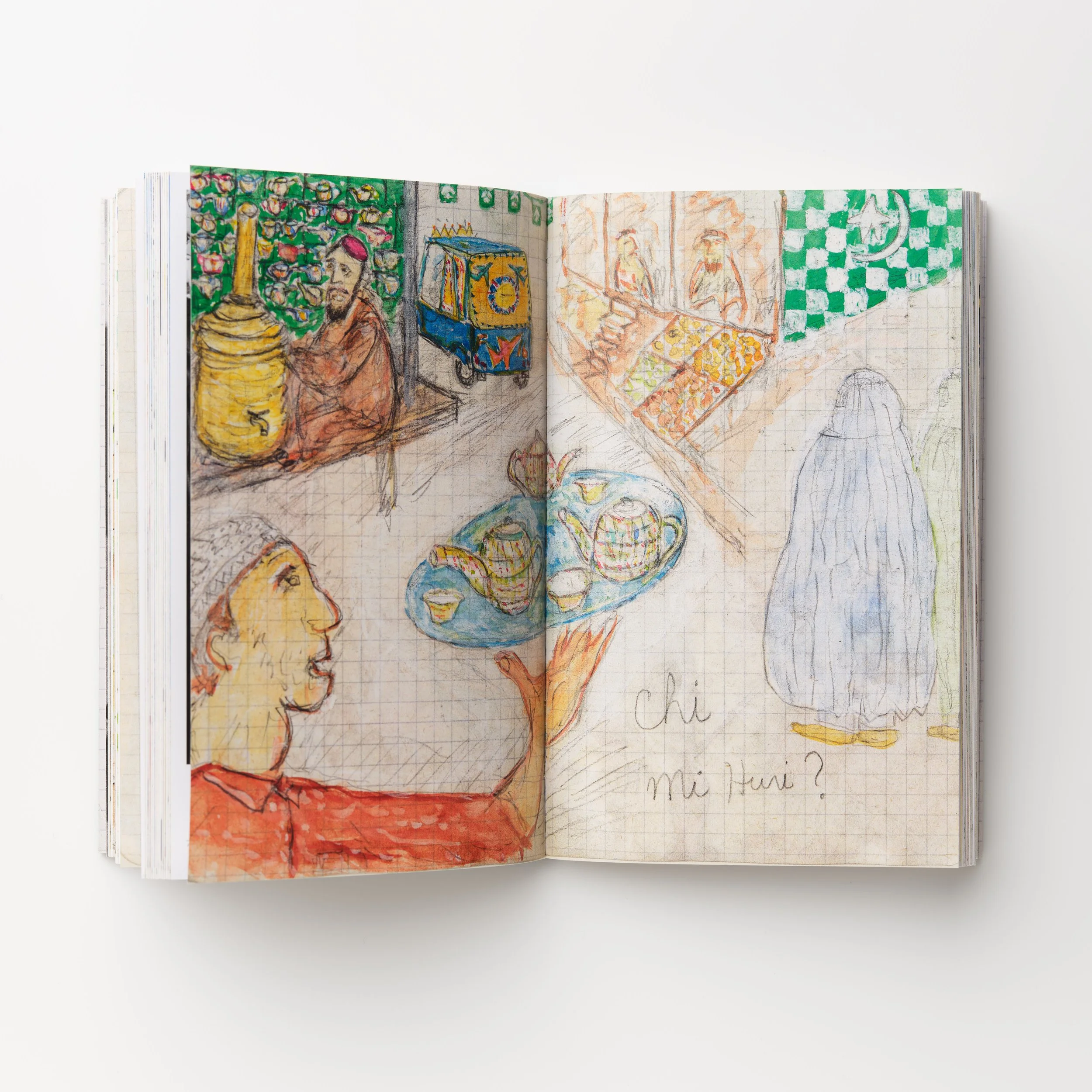
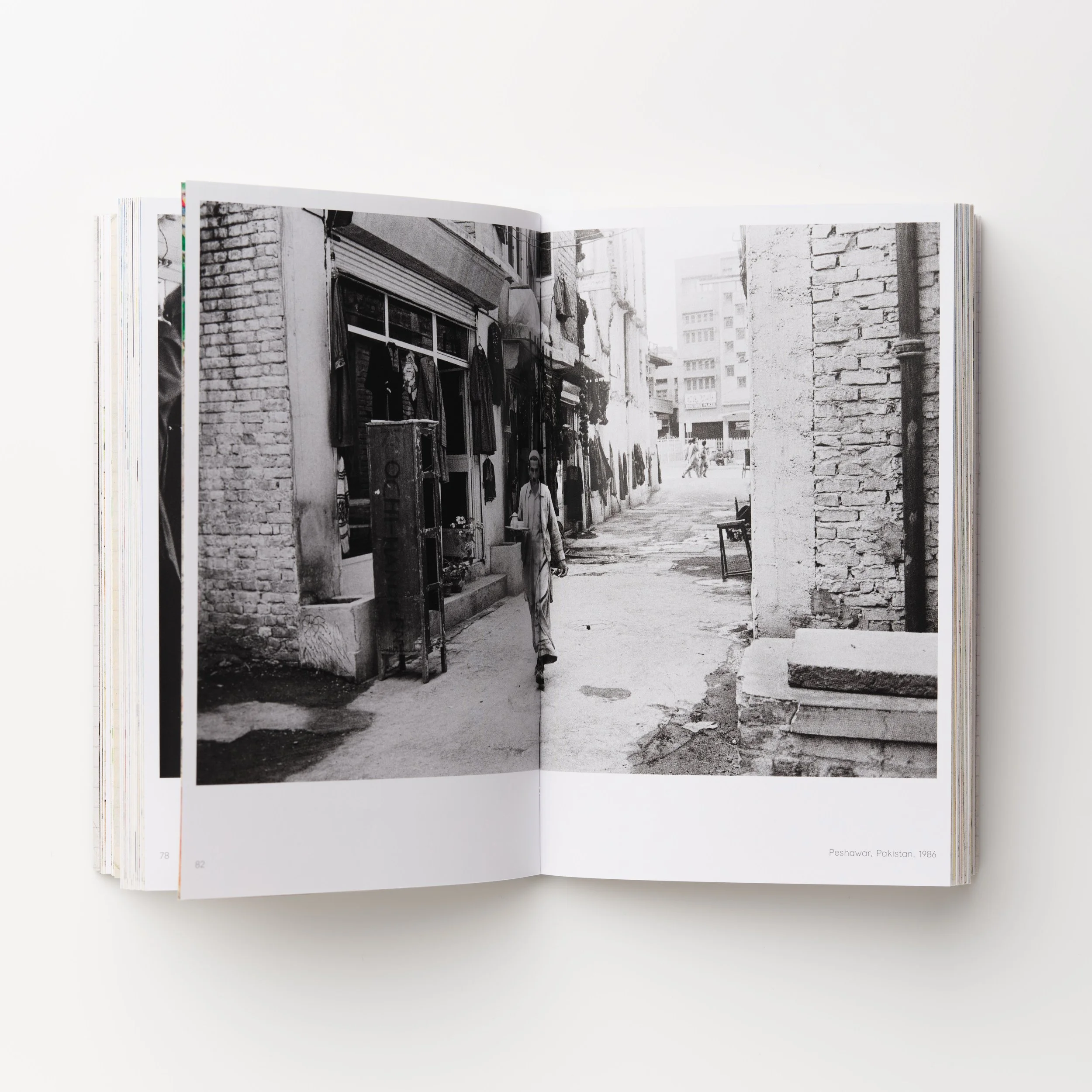
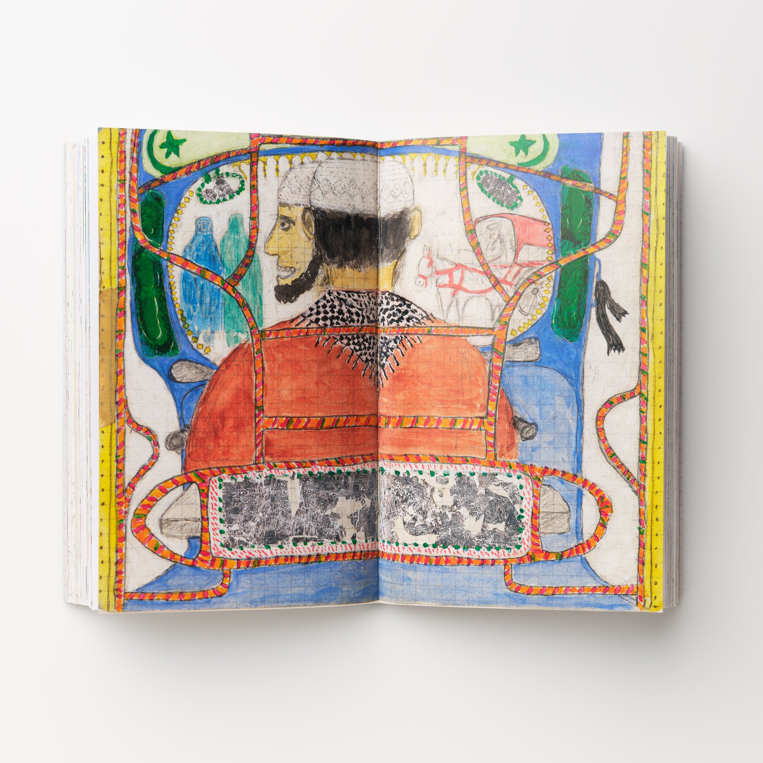
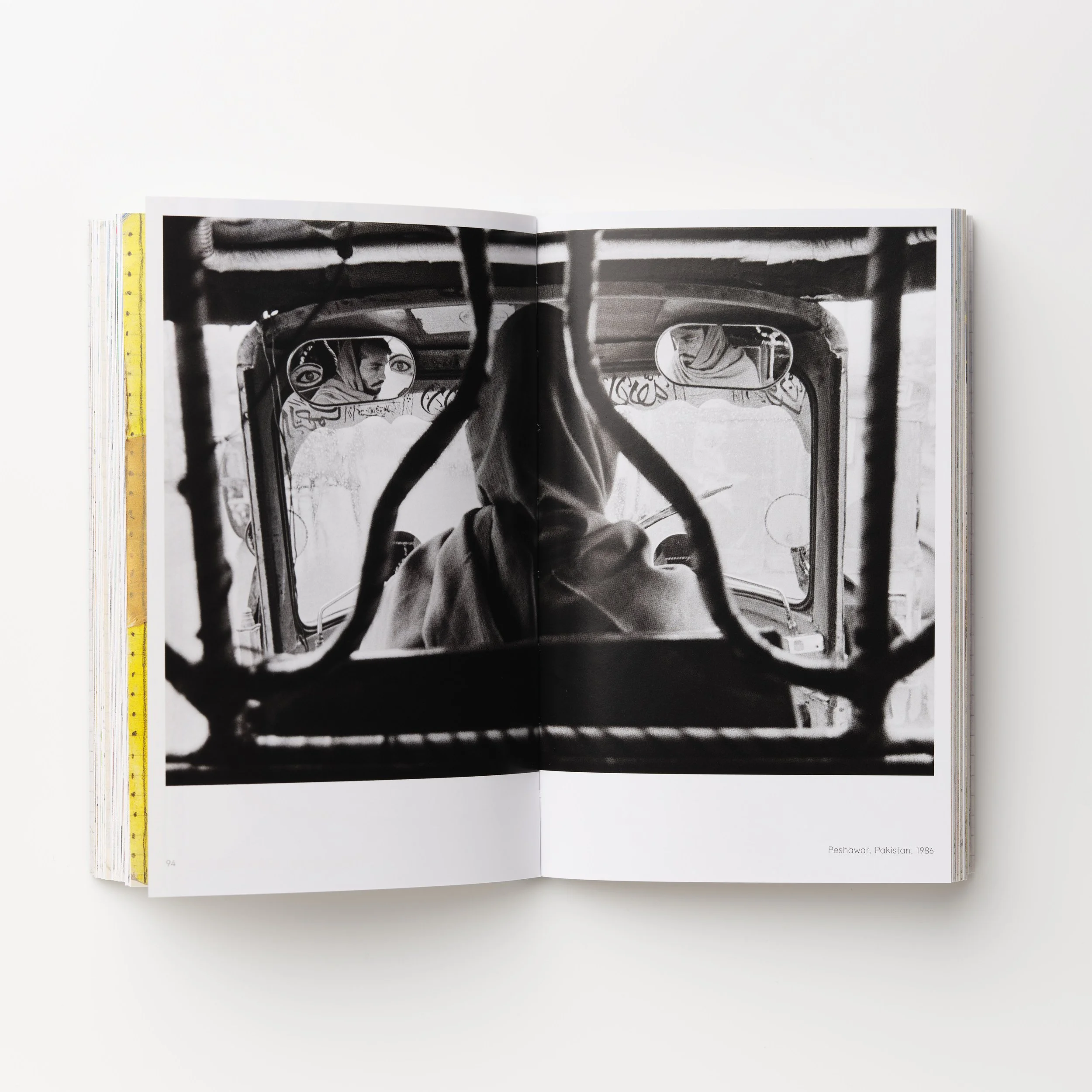
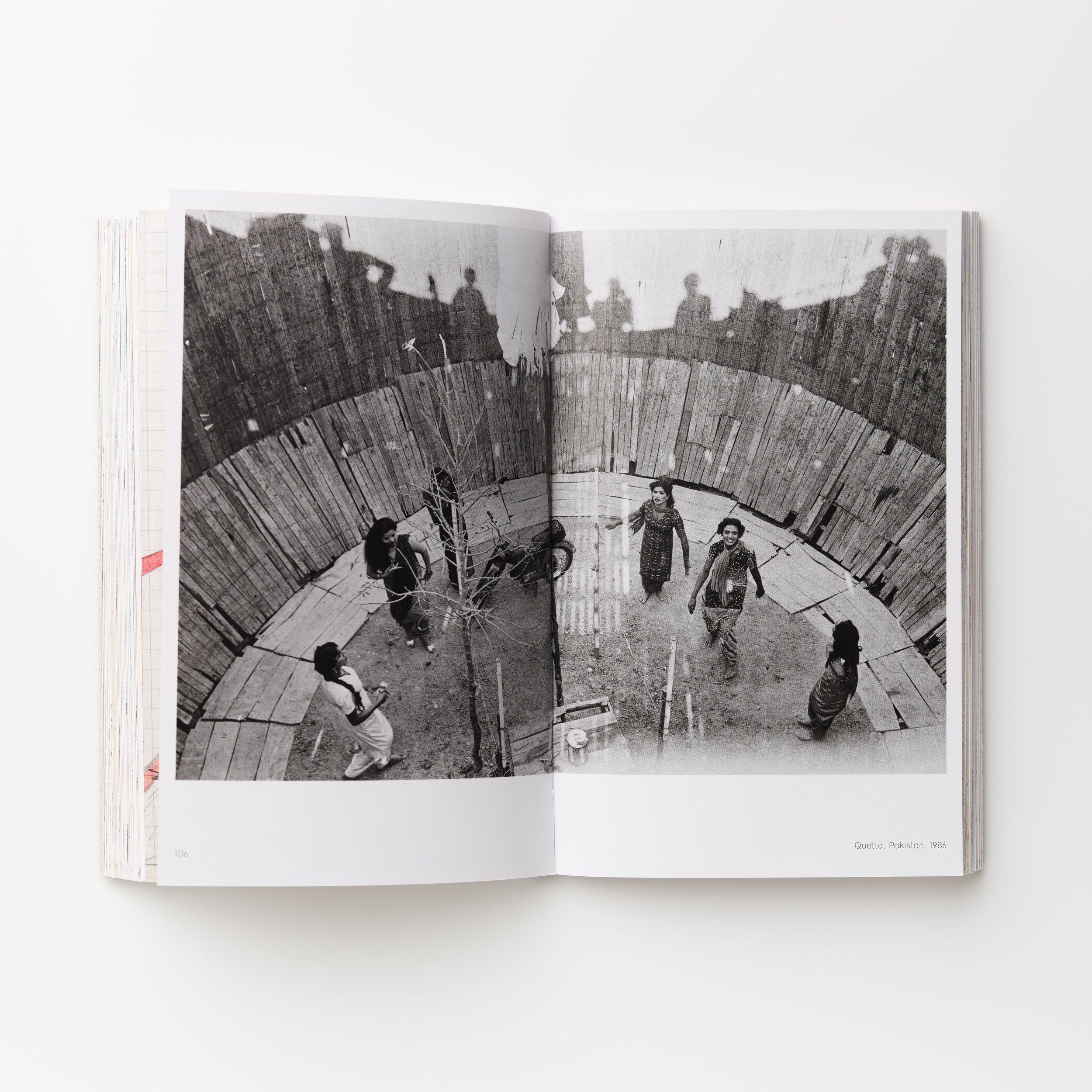
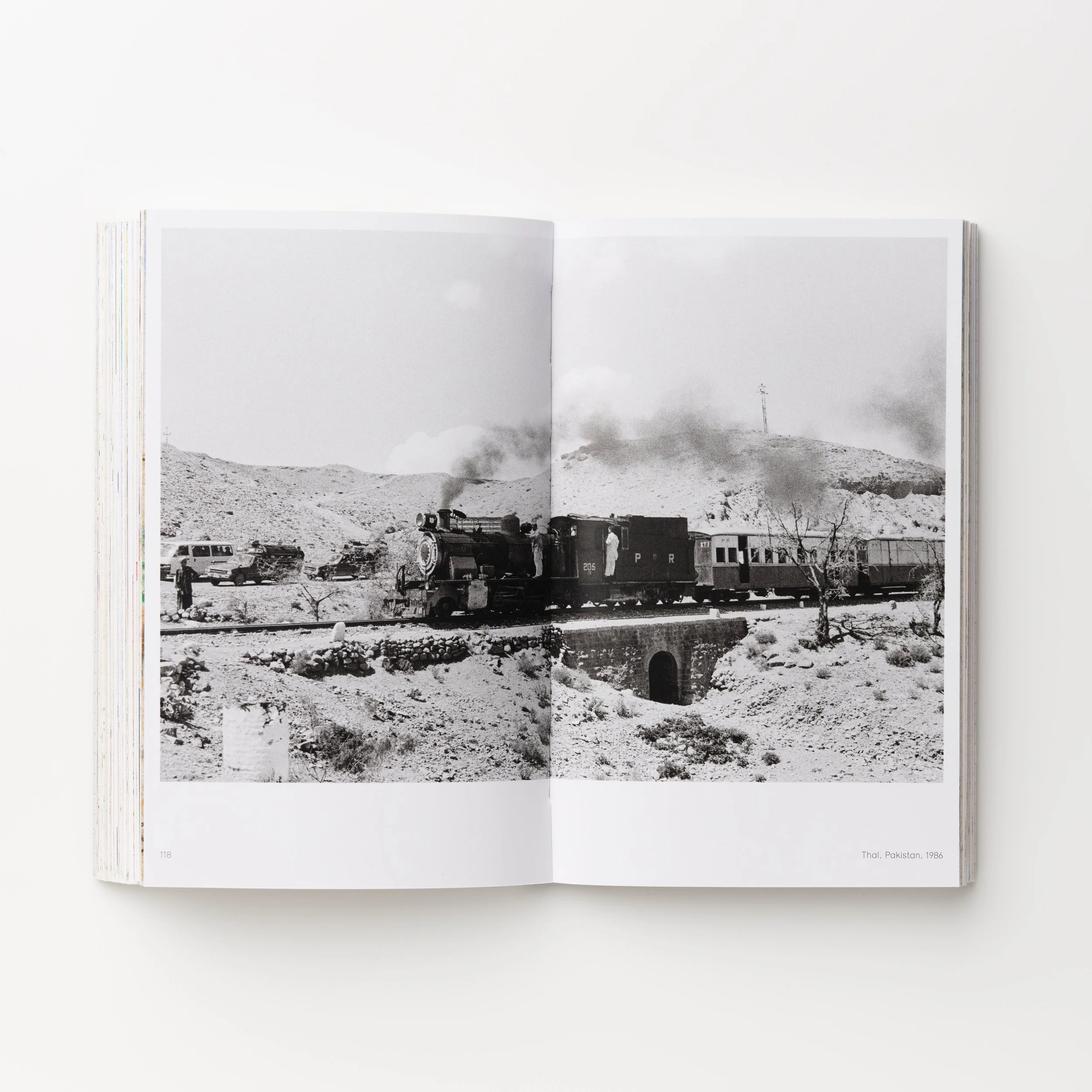
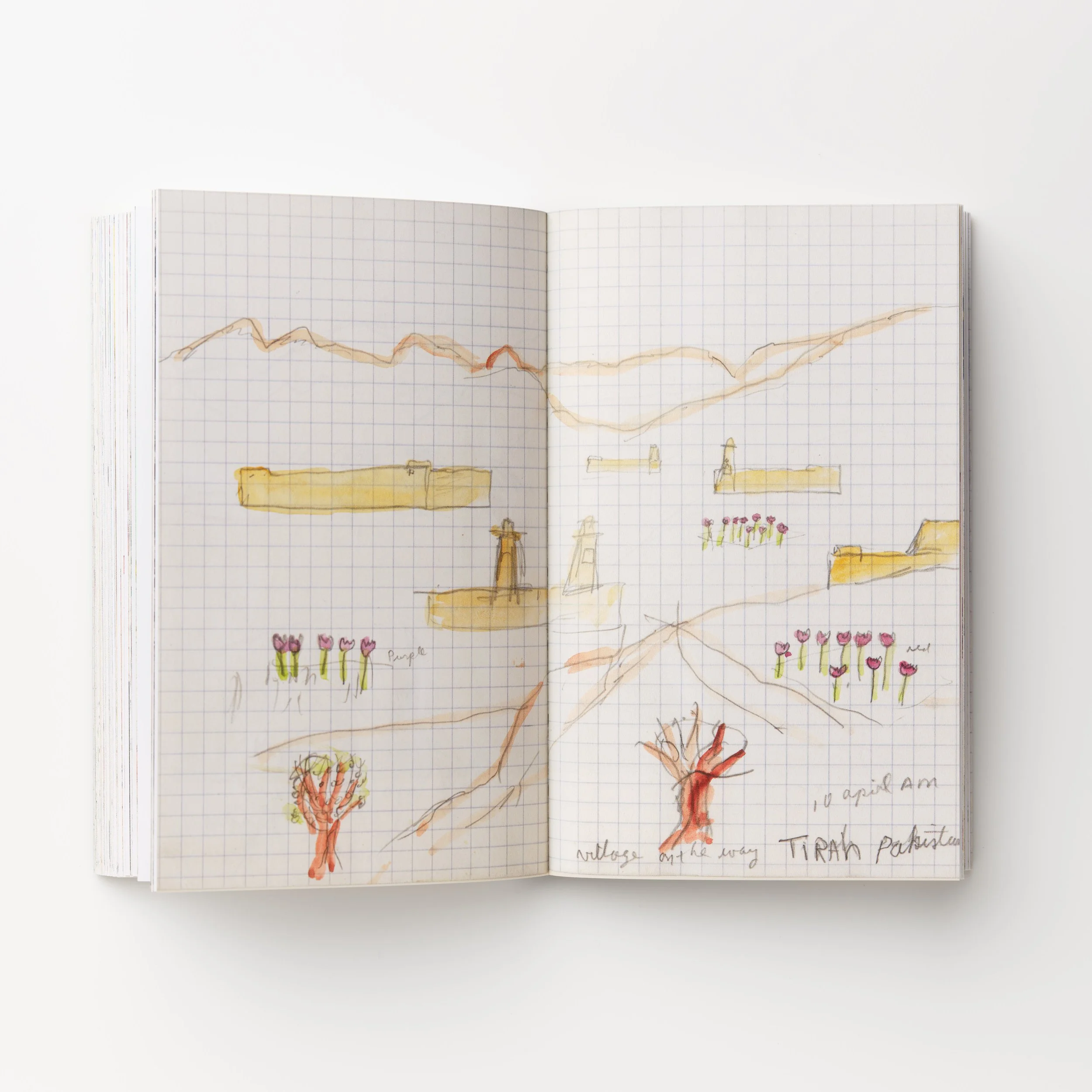
The Power of Observation is a book of drawings by Edward Grazda based on (at the time, undeveloped) photographs taken by Grazda in his travels in Asia the 1980s.
“These drawings were made while I travelled. After a day of photographing I would draw something that I had photographed (or thought I had photographed) that day. It was only months later that I would see the photographs of the things I had drawn from Memory. It was as if, when making a photo, the image was not only fixed on the film, but also fixed in my mind, to manifest itself in a small notebook drawing. Today, some 35 years later, I am not sure how these drawings came to be.” —Edward Grazda
Edward Grazda was born in Queens, New York (1947), and got his BFA from RISD in 1969. He has photographed in the USA, Latin America and Asia. His published books include: Afghanistan Diary (1992-2000), NY Masjid: The Mosques of New York (2002), A Last Glance: Trading Posts of the Four Corners (2015), Mean Streets: NYC 1970-1985, (2017), On The Bowery: NYC 1971 (2019) - all from PowerHouse Books. His work is in the collections of MOMA, The Met, NYPL, SFMOMA, Centro de la Imagen (Lima), Harvard Art Museum, Museum of the City of New York, George Eastman House, and many private collections. He has taught at Harvard, The Boston Museum School and the International Center of Photography. Recent publications include Disasters of War: Portraits by Khalid Hadi (edited and designed by Grazda) and Visual History Afghanistan 1980-2004. Both published by Fraglich publishing (fraglich.com). In September 2021 PowerHouse published: Asia Calling: A photographers Notebook 1980-1997. Grazda lives in Chilmark, MA and Providence, RI. See more of Grazda’s work at www.edwardgrazda.com
Designer Statement:
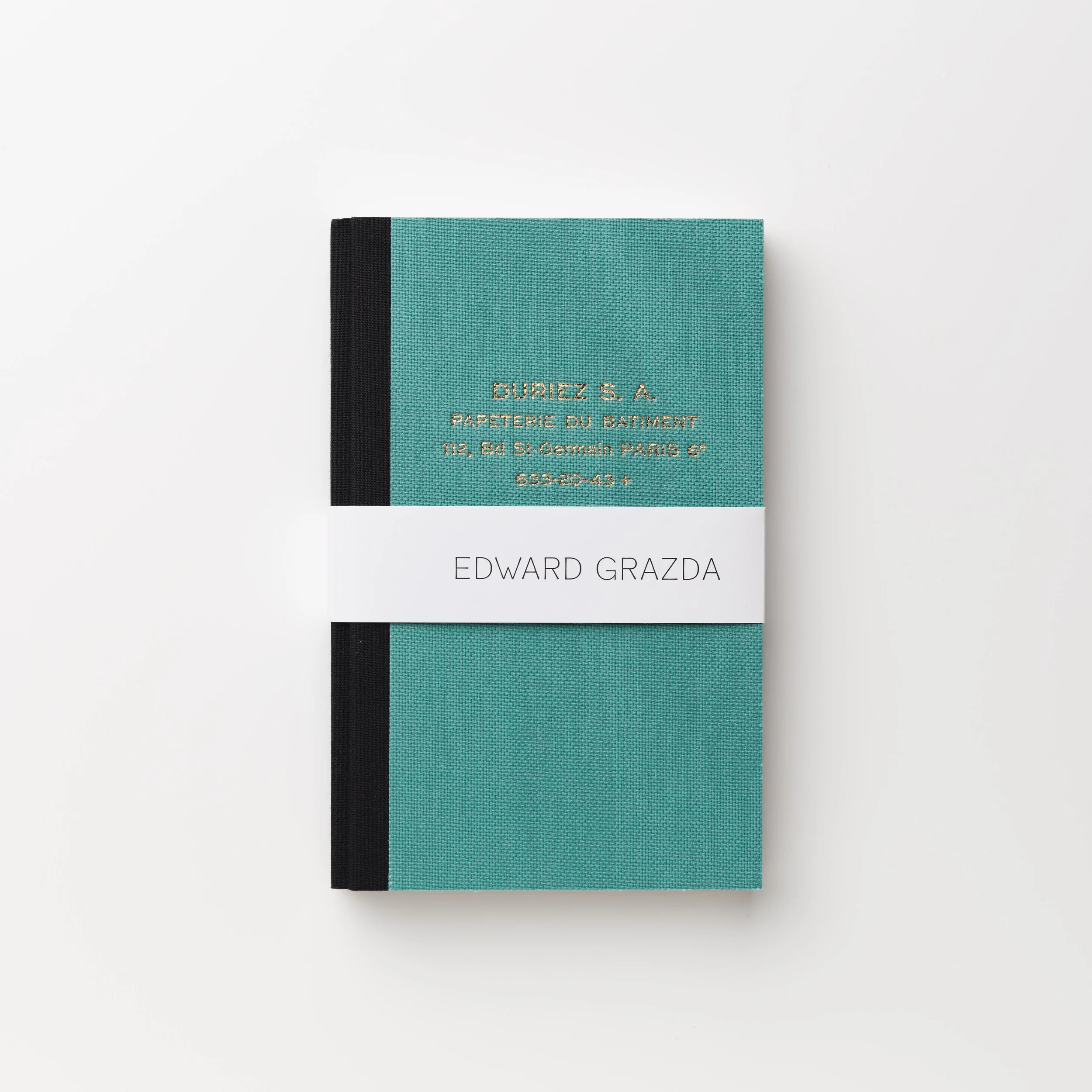
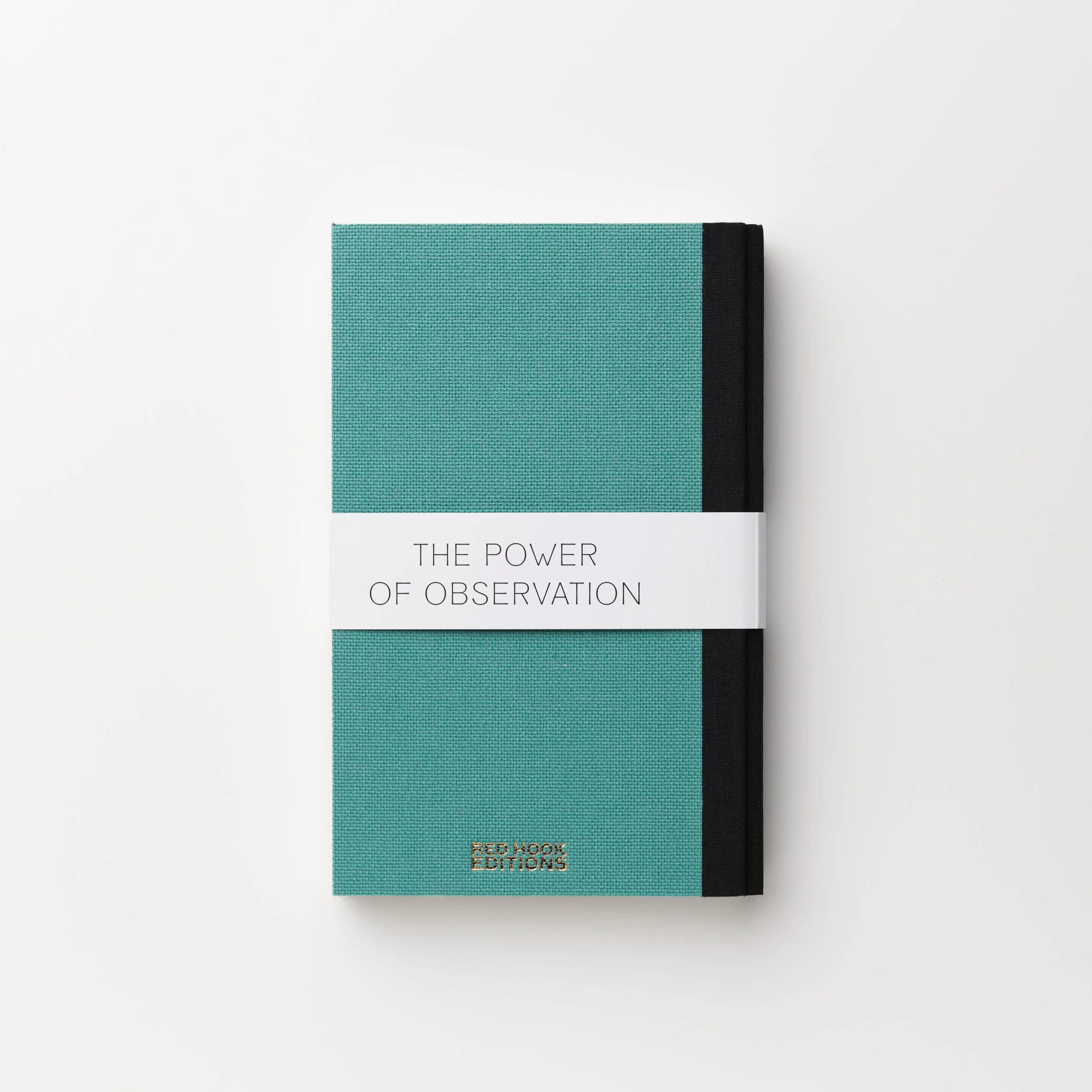
I’ve designed several books with Ed now. Aside from brilliant work, he always starts with a clear concept and a tight edit, and then he’s quick and decisive with each round of design I show him. For this project, we were presenting two related bodies of work: a series of photos and the contents of a small sketchbook—drawings Ed would make after each day of shooting, based on his memories of the photos he’d shot. After some discussion, we decided that the book should present the images in the order that Ed saw them—that is, each drawing, followed by the photographic image that had inspired it, but which he printed later. I tried various book dimensions and formats, and mocked up a variety of ways we could move from each drawing to its corresponding photo—elaborate gatefolds, pairings on a spread—and considered how they should be sized. In the end, we went with the most straightforward approach—we’d replicated the original sketchbook, a beautiful small hardcover made by a now-defunct French stationer, whose address was gold-foil-stamped on the green linen-wrapped cover. Each drawing would be reproduced full-bleed in four-color on a spread, at its original size, followed by a duotone of its corresponding photo set in a white border with a brief caption below. The printer, Grafiche Antiga, would match the green linen, black binding, and gold foil stamping of the original cover. Flipping through the book would be like flipping through Ed’s original sketchbook, with, after every gorgeous, richly-colored drawing, the addition of a crisp black-and-white photograph. Ed’s suggested adding a bellyband with his name and the book title. I designed this in black and white, so the cover now represents both bodies of work the book contains. -F.R.